Print and Layout Design
HalfMoon Education Inc.
At HalfMoon Education Inc., a small, family-owned not-for-profit, I designed print brochures to promote the organization’s continuing education programs, using layout, typography, and visual hierarchy to create clear, on-brand communication. Working within the constraints of a limited budget and basic printing methods, including grayscale printers, I adapted designs to remain visually effective and cost-efficient. I also developed custom templates so team members without design experience could maintain brand consistency in my absence.
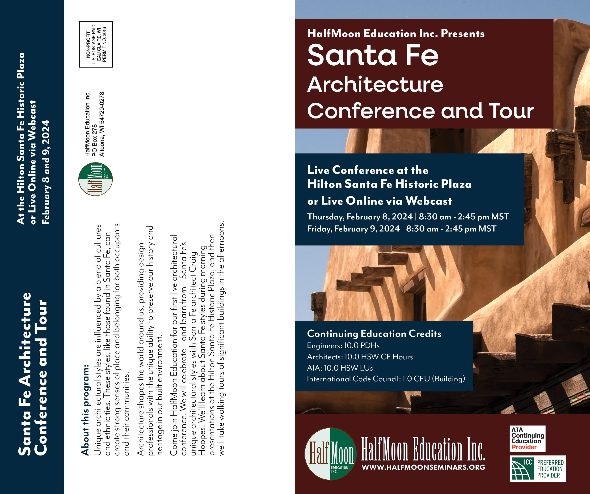
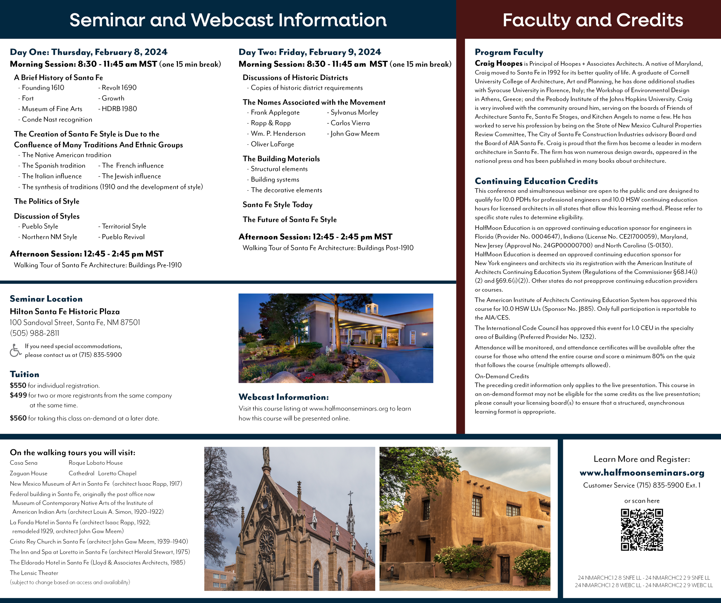
Santa Fe Architecture Conference and Tour Four-Page Brochure
A full-color, four-page brochure designed to promote a nationally advertised continuing education program. Created to organize extensive course information into a clear, easy-to-navigate layout, the brochure uses visual hierarchy, typography, photography, and consistent branding to guide readers through schedules, faculty, registration details, and program highlights.
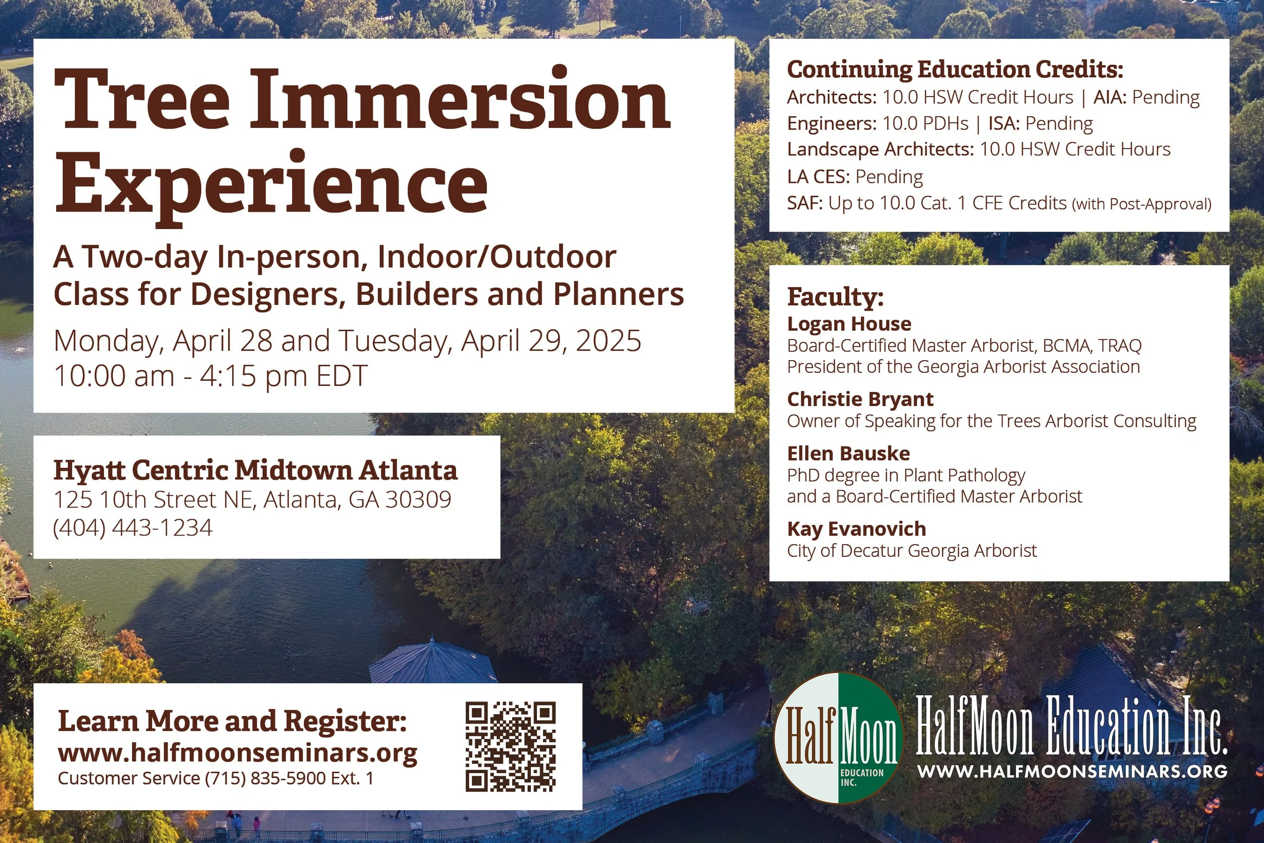
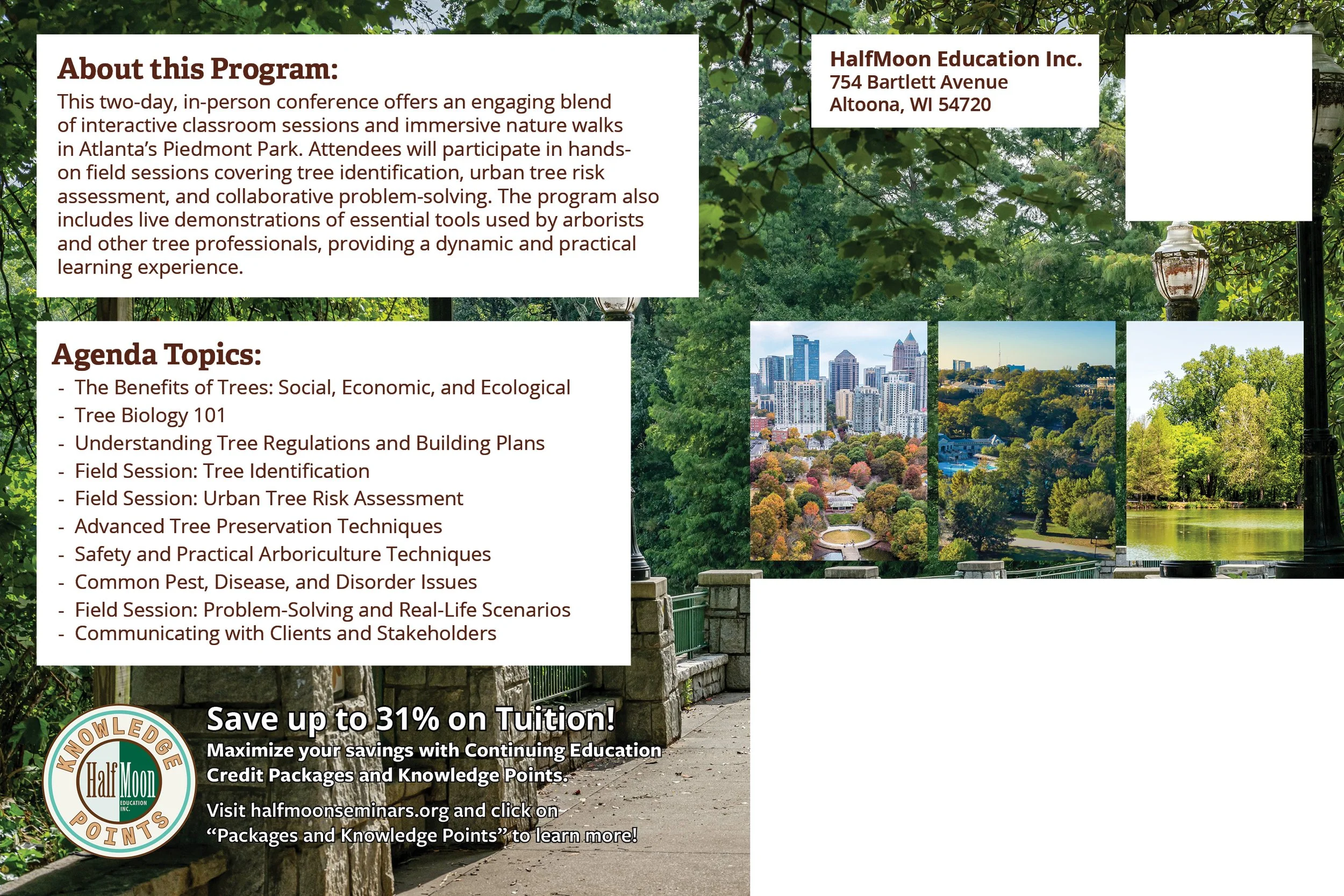
Tree Immersion Experience Postcard
A full-color promotional postcard designed for a nationally advertised continuing education program. Created to capture attention quickly, the design pairs bold photography with concise messaging and a strong visual hierarchy to highlight essential information and encourage recipients to register.
Tri-Fold Brochure Templates
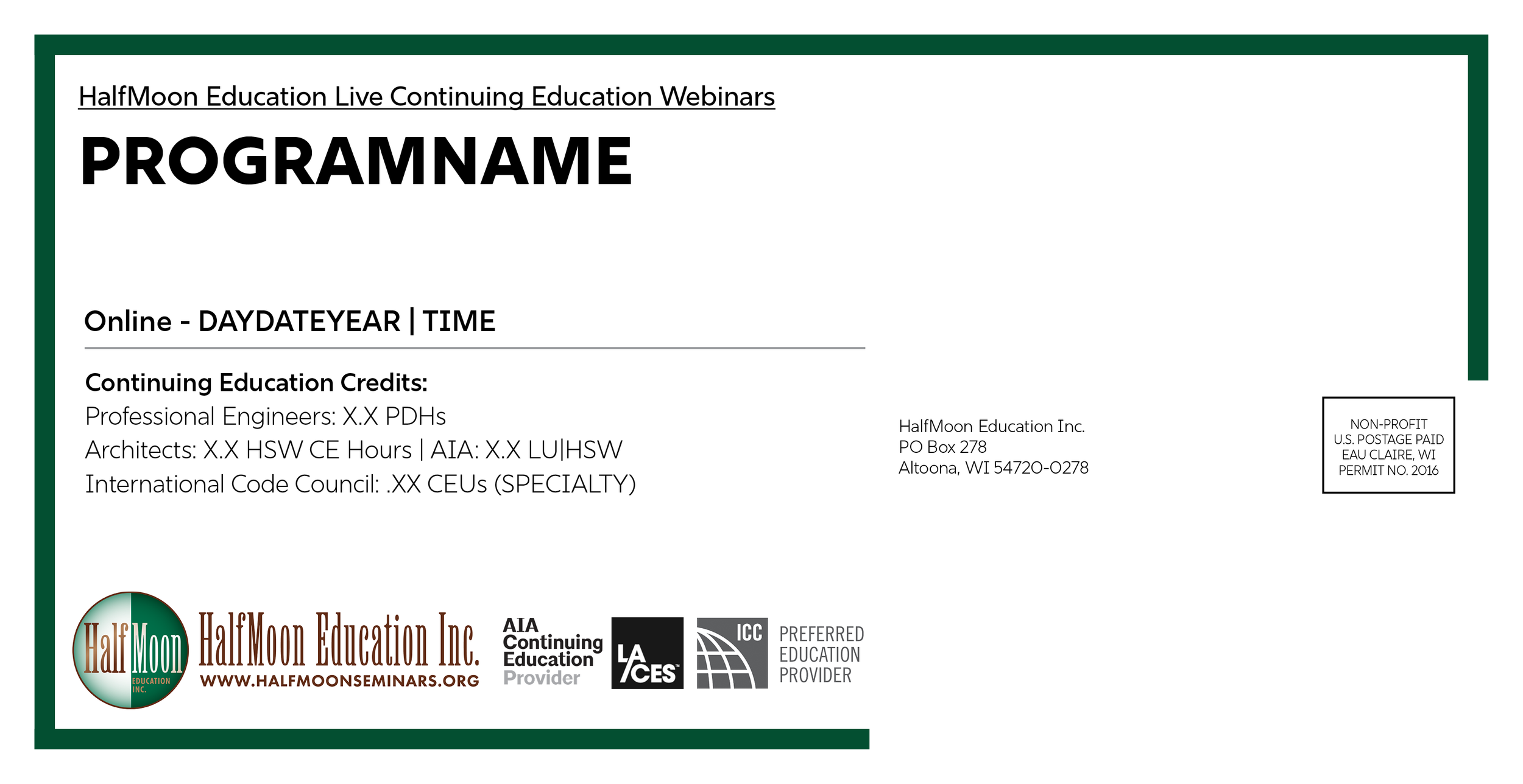
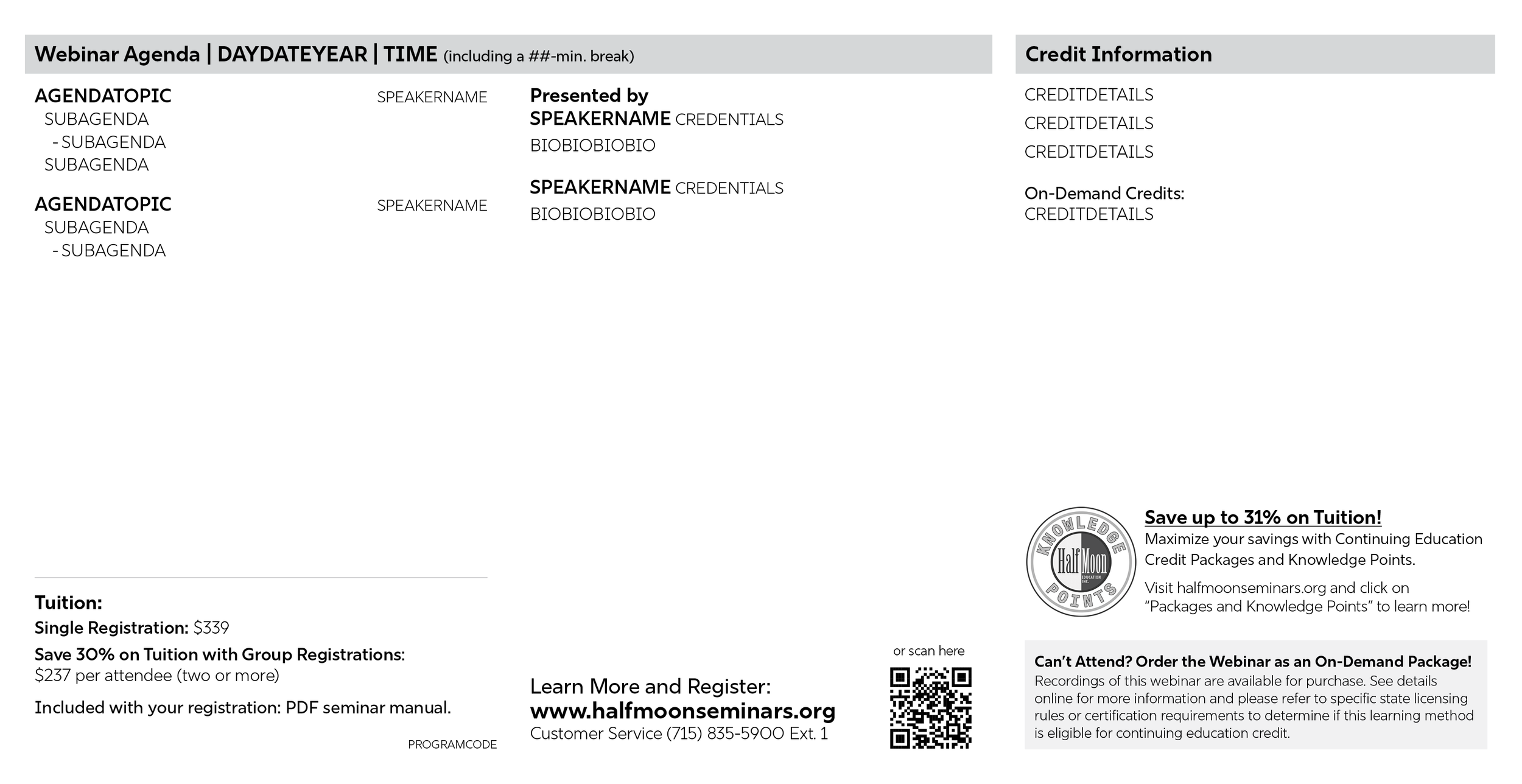
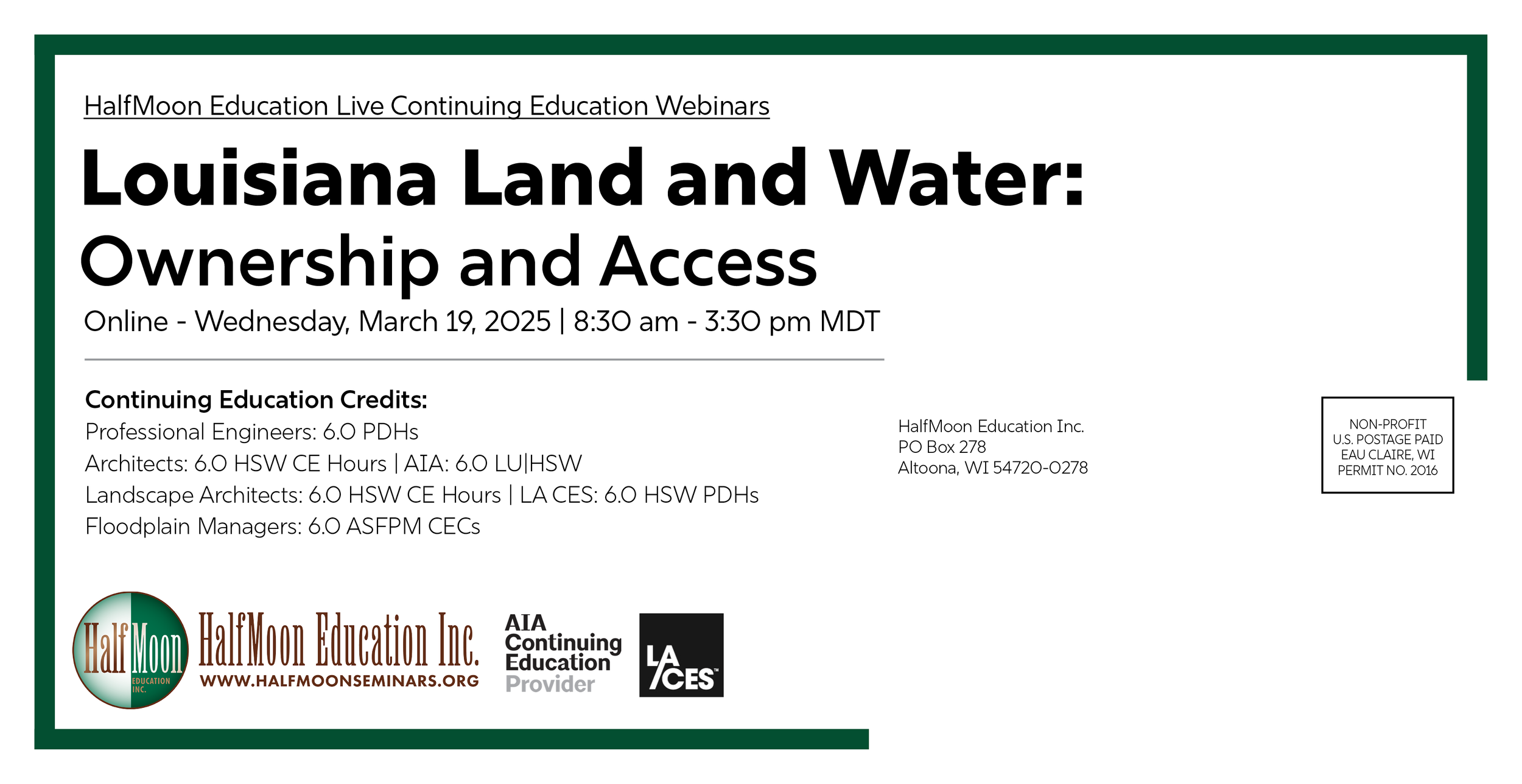
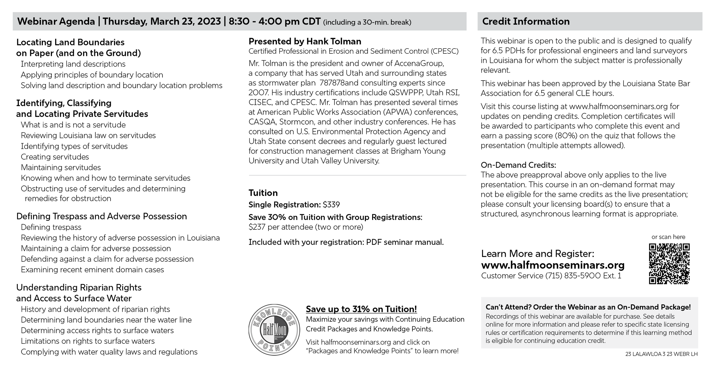
I developed a series of tri-fold brochure templates that enabled marketing team members without design experience to create and update materials in my absence. The print-ready templates were designed for a custom 16 × 9-inch format and aligned with pre-printed paper stock, where color elements and logos were already in place. Multiple template variations accommodated different layout and space constraints while maintaining a consistent structure. The designs use HalfMoon Education's website color palette to maintain visual consistency with the organization's branding. The final two images show the front and back of a completed brochure created for digital distribution. The templates became the standard format for the majority of HalfMoon Education's programs.
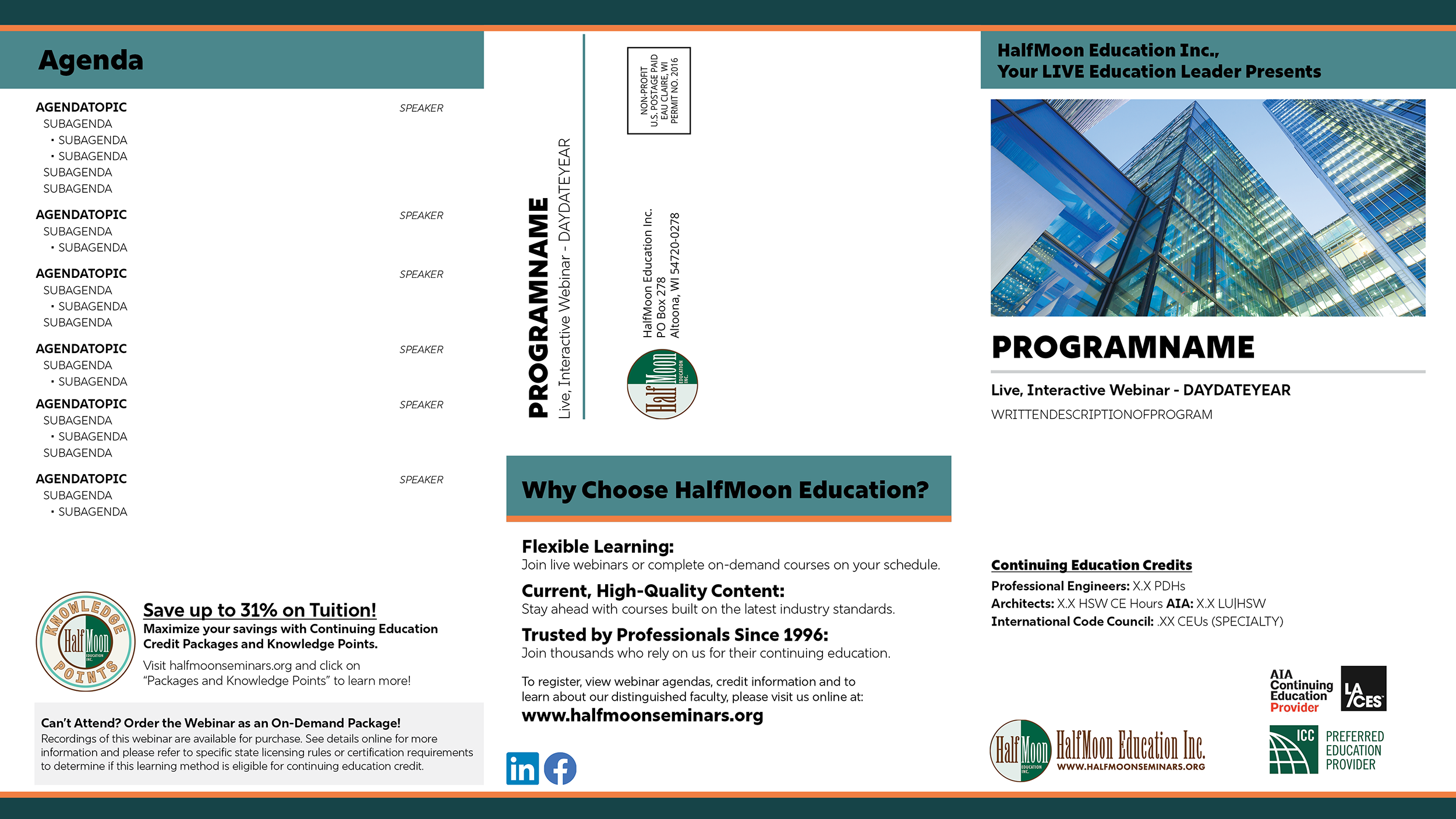
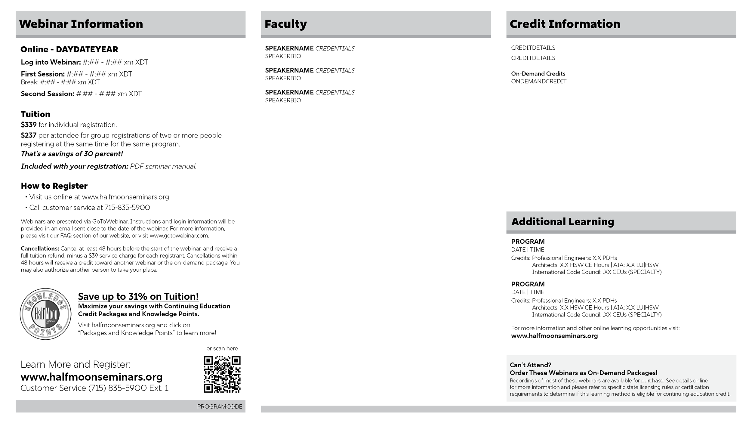
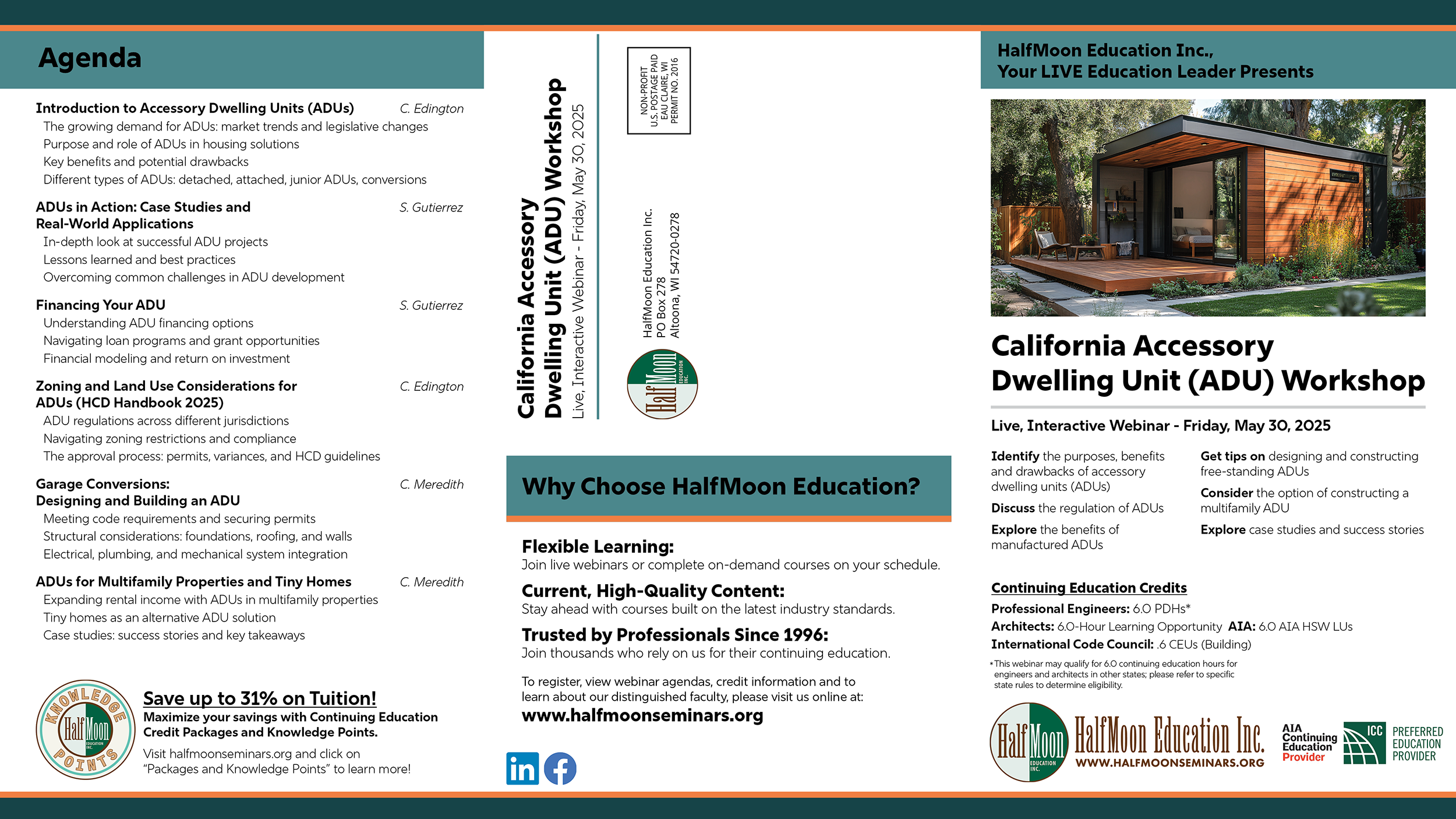
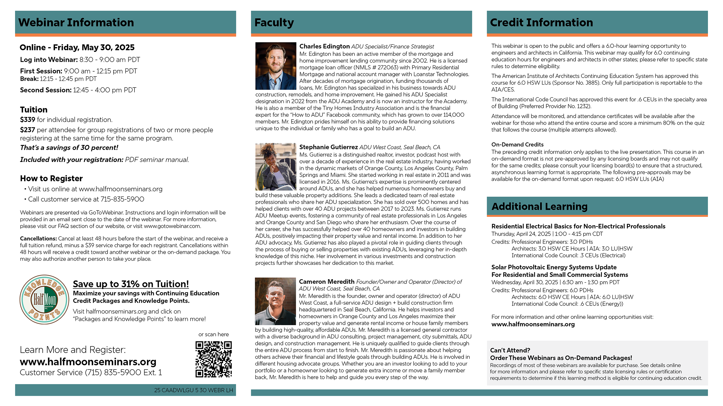
I also created a streamlined postcard template designed for cost-efficient direct mail campaigns. Sized at 11 × 5.6 inches, the format was intentionally developed to reduce postage and printing costs for the organization. Color elements, derived from the organization’s logo, were pre-printed on the card stock, requiring the design to work within grayscale printing limitations. The layout utilizes grayscale-friendly design elements to ensure clarity when printed on in-house printers, while maintaining strong visual hierarchy and readability.